What Your Font Is Saying Behind Your Back (And Why It Matters More Than You Think)
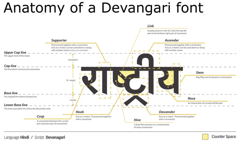
Photo: JMF, CC0, via Wikimedia Commons
Let's be real for a second. When most business owners think about branding, they think logos, colors, maybe a catchy tagline. Typography? That usually gets bumped to the bottom of the list — something to figure out after everything else is locked in. But here's the thing: your font is working overtime whether you're paying attention to it or not.
Every time someone lands on your website, opens your email, or glances at your business card, their brain is processing your typeface before it processes your actual message. And that split-second reaction? It shapes how they feel about your entire brand.
The Brain Doesn't Read First — It Feels First
There's a whole body of research behind how humans respond to letterforms, and the short version is this: typefaces carry emotional weight. A rounded, bubbly font signals approachability and warmth. A sharp serif communicates authority and tradition. A hand-lettered script whispers creativity and intimacy.
Psychologists call this "semantic congruence" — when the visual style of your text matches the meaning of your message, people trust it more. When they don't match, something feels off, even if the reader can't articulate exactly why.
Think about it this way: if a law firm's website used a bubbly, cartoonish font, you'd probably hesitate before calling them. Conversely, if a children's birthday party planning company used stiff, formal block letters, it would feel cold and uninviting. Neither business did anything wrong with their services — but their font choice undermined the experience before it even started.
Real Brands That Got Typography Right
Some of the most recognizable American brands have built serious equity through intentional typography.
Coca-Cola has used a custom script since the 1800s. That flowing, handwritten style isn't just nostalgic — it communicates warmth, familiarity, and a certain timeless Americana that no modern sans-serif could replicate. The font is part of the product experience.
Apple made a bold move when it shifted from its original rounded font to the clean, neutral Myriad Pro and later San Francisco. The switch mirrored the brand's evolution from scrappy tech upstart to premium lifestyle company. The typography said "we're sophisticated and precise" before the product specs even came into play.
The New York Times has held onto its gothic serif masthead for over a century. Why? Because in an era of digital noise and fleeting attention, that typeface communicates credibility, weight, and permanence. It says trust us before you've read a headline.
When Fonts Miss the Mark
Not every brand gets it right, and the consequences can be surprisingly significant.
Gap's 2010 logo redesign is a textbook case study in font-driven backlash. The company swapped its iconic blue-box logo for a generic Helvetica wordmark with a tiny gradient square tacked on. The internet revolted — and not just because people loved the old logo. The new font felt corporate, cold, and completely disconnected from the brand's casual, accessible identity. Gap reversed the decision within a week.
Then there's the infamous Comic Sans problem. Plenty of small businesses have leaned on it because it feels friendly and approachable. And in isolation, sure, it can work — it was literally designed for a cartoon dog's speech bubble in Microsoft Bob. But when a dental office, a financial planner, or a real estate agent uses Comic Sans in their materials, it quietly chips away at professional credibility. Customers may not say "that font is unprofessional," but they feel it.
The Strategic Questions to Ask Before Choosing a Font
So how do you actually make a smart font decision for your brand? Start by asking yourself a few honest questions:
Who is your customer, and what do they already trust? If your audience skews older and traditional, a clean serif might feel more familiar and trustworthy. If you're targeting younger creatives or tech-forward buyers, a geometric sans-serif might hit differently.
What emotion do you want to trigger first? Excitement? Calm? Confidence? Authority? Map that feeling to a typeface category before you start scrolling through font libraries.
Does your font work across all your touchpoints? A font that looks gorgeous on a printed brochure might render terribly on a mobile screen. Test it everywhere before committing.
Are you being consistent? One of the biggest mistakes small businesses make is using three or four different fonts across their website, social media graphics, and print materials. Consistency builds recognition. Inconsistency breeds confusion.
The Categories Worth Knowing
You don't need a design degree to make a smart font call. A basic understanding of typeface categories goes a long way:
- Serif fonts (Times New Roman, Georgia, Garamond) convey tradition, authority, and reliability. Great for law, finance, publishing, and established brands.
- Sans-serif fonts (Helvetica, Futura, Open Sans) read as modern, clean, and approachable. A go-to for tech, healthcare, and lifestyle brands.
- Script and handwritten fonts suggest creativity, elegance, or personal touch. Often used in food, beauty, and boutique retail — but easy to overuse.
- Display and decorative fonts are bold, distinctive, and best reserved for headlines or logos. Use sparingly, or they become visual noise.
Typography Is a Brand Investment, Not an Afterthought
At Jay Creative Fixz, we've seen firsthand how a font swap — when done intentionally and strategically — can completely shift how a business is perceived. It's not about chasing trends or picking something pretty. It's about making sure every element of your brand is pulling in the same direction.
Your font is always talking. The only question is whether it's saying what you actually want it to say.
If you're not sure your current typography is working for you, that's worth a serious look. Because in branding, the details aren't just details — they're the whole story.