Your Brand Looks Perfect on a Mood Board — So Why Does It Fall Apart Everywhere Else?
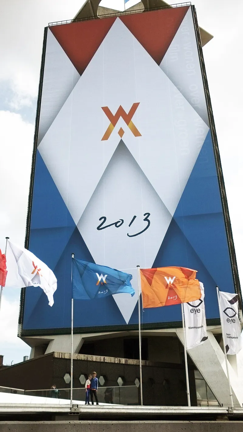
Photo: Chen Lu, CC BY-SA 4.0, via Wikimedia Commons
The Pretty Portfolio Problem
Here's a scenario that plays out more often than most business owners want to admit: You spend weeks — maybe months — getting your logo just right. The colors feel perfect. The typography is clean and intentional. Your brand guide is a work of art. You send it off to your designer with a chef's kiss.
Then real life happens.
Somebody on your team resizes the logo for an Instagram Story and it looks squished. Your email newsletter uses a slightly different shade of your brand blue because nobody could remember the exact hex code. Your packaging vendor prints your signature green as something closer to olive. And your YouTube thumbnails? They look like they belong to a completely different company.
Welcome to the consistency trap — the gap between a brand that looks great in isolation and one that actually holds up in the real world.
Why Isolation Is the Enemy of a Real Brand
Most branding work happens in controlled conditions. A designer opens up Illustrator or Figma, drops your logo on a clean white background, pairs it with your fonts, and everything looks chef's-kiss beautiful. That's the vacuum version of your brand.
But your customers don't live in a vacuum. They're scrolling through Instagram at 11pm, skimming an email on their lunch break, opening a package on their front porch, or watching a reel on their phone while waiting in line at Starbucks. Every one of those moments is a brand touchpoint — and each one comes with its own technical constraints, dimensions, lighting conditions, and context.
The brands that win aren't necessarily the ones with the most beautiful logos. They're the ones that built a system — not just a set of assets.
What a Brand System Actually Is (And Isn't)
A lot of people think a brand system is a PDF with a logo, some fonts, and a color palette. That's a brand starter kit, not a system.
A real brand system accounts for how your visual identity behaves across multiple formats and contexts. It includes things like:
- Logo variations — a primary version, a stacked version, an icon-only mark for small applications, and a reversed version for dark backgrounds
- Color usage rules — not just what your colors are, but which ones lead in which contexts, and what's off-limits
- Typography hierarchy — how headlines, subheads, body copy, and captions relate to each other on screen vs. in print
- Image and illustration style — so your photography on Instagram matches the vibe of your pitch deck
- Motion and video guidelines — especially important now that Reels, TikTok, and YouTube Shorts are major brand touchpoints
- Template library — pre-built assets for social posts, email headers, presentations, and more
When these pieces are designed to work together across contexts, your brand starts to feel cohesive rather than just pretty.
Brands That Nailed It — and One That Didn't
Look at how Mailchimp operates across touchpoints. Whether you're on their website, reading a marketing email, or seeing one of their billboard ads, there's a consistent warmth and quirkiness to everything. The Freddie icon scales down beautifully. The yellow is unmistakable. The tone of voice matches the visual identity at every turn. That didn't happen by accident — it happened because someone built a system, not just a logo.
On the flip side, think about smaller brands — maybe even some you've personally worked with — where the Instagram grid looks totally different from the website, which looks nothing like the business card. It's jarring. And while customers might not consciously say "this brand is inconsistent," they feel it. It erodes trust. It makes the brand feel unestablished, even if the product itself is excellent.
Gap is a classic cautionary tale on a bigger scale. Their infamous 2010 logo redesign wasn't just a design failure — it was a rollout failure. The new identity appeared online before any cohesive system was in place to support it, and the backlash hit before the brand had a chance to contextualize the change. They reverted within a week.
The Flexibility Factor: Consistency Doesn't Mean Rigidity
Here's where a lot of brands overcorrect. After getting burned by inconsistency, they lock everything down so tightly that the brand becomes brittle. Every social post has to get approved. Every vendor has to submit proofs. The result? Slower execution, frustrated teams, and a brand that still looks off because the rules don't account for real-world application.
The goal is a flexible system — one with enough structure to stay recognizable, but enough room to adapt to different formats without breaking down.
Think of it like a jazz ensemble. Everyone knows the key, the tempo, and the structure of the song. But within that framework, each musician can improvise. The result feels cohesive and dynamic at the same time.
For your brand, that might mean:
- Allowing two or three approved color combinations rather than one rigid layout
- Creating "on-brand" templates that give team members creative flexibility within guardrails
- Documenting "the spirit" of your brand, not just the specs — so people understand why the rules exist, not just what they are
Building Your Brand for the Real World
If your brand only looks good in a pitch deck, it's not finished yet. Here's how to pressure-test it before it hits the market:
1. Map your touchpoints. List every place your brand shows up — your website, social channels, email, packaging, invoices, signage, merch, video content, and anywhere else. Then ask: does our current brand system have guidance for each of these?
2. Stress test your logo. How does it look at 16x16 pixels as a favicon? How does it look on a dark background? Printed on a black mug? Embroidered on a hat? If it breaks in those contexts, you need additional logo variations.
3. Audit your brand in the wild. Pull up your last 20 social posts. Look at your last 5 email campaigns. Screenshot your website on mobile. Does it all feel like it belongs to the same brand? If not, that's your gap.
4. Build templates before you need them. Don't wait until your social media manager needs to post in 10 minutes to figure out your brand's Instagram template. Build those assets proactively and put them somewhere accessible.
5. Document the "why" behind your brand decisions. The hex code matters. But so does understanding that your brand uses warm tones because you want to feel approachable, not clinical. When people understand the intent, they make better decisions in edge cases.
The Takeaway
A great brand isn't just a beautiful logo — it's a system that performs under pressure. It shows up consistently whether someone's seeing you for the first time on a tiny phone screen or opening a package on their doorstep. That kind of brand doesn't happen by accident. It's built with intention, tested against reality, and maintained with care.
At Jay Creative Fixz, we're big believers that bold branding only works when it's built to last in the real world — not just look good in a presentation. If your brand is starting to feel like it's held together with digital duct tape, it might be time to build the system underneath it.